Elements
Typography
Typography sets default styles for headings, paragraphs, semantic text, blockquote and lists elements.
Headings
H1 Heading 40px
H2 Heading 32px
H3 Heading 28px
H4 Heading 24px
H5 Heading 20px
H6 Heading 16px
<h1>H1 Heading</h1>
<h1>H1 Heading <small class="label">40px</small></h1>
<span class="h1">H1 Heading</span>
Paragraphs
Lorem ipsum dolor sit amet, consectetur adipiscing elit. Praesent risus leo, dictum in vehicula sit amet, feugiat tempus tellus. Duis quis sodales risus. Etiam euismod ornare consequat.
Climb leg rub face on everything give attitude nap all day for under the bed. Chase mice attack feet but rub face on everything hopped up on goofballs.
<p>Lorem ipsum dolor sit amet, ...</p>
<p>...</p>
Semantic text elements
<abbr>
<strong> <b>
<cite>
Hello World!
<code>
<del>
<em>
<i>
<ins>
<kbd>
<mark>
<ruby>
<s>
<samp>
<sub>
<sup>
<time>
<u>
<var>
Optimized for east asian fonts
你好, こんにちは, 안녕하세요
Chinese (Simplified)
革命不是请客吃饭,不是做文章,不是绘画绣花,不能那样雅致,那样从容不迫,“文质彬彬”,那样“温良恭俭让”。革命就是暴动,是一个阶级推翻一个阶级的暴烈的行动。
Chinese (Tranditional)
山不在高,有仙則名;水不在深,有龍則靈。斯是陋室,惟吾德馨。苔痕上階綠,草色入簾青;談笑有鴻儒,往來無白丁。可以調素琴,閱金經。無絲竹之亂耳,無案牘之勞形。南陽諸葛廬,西蜀子雲亭。孔子云:「何陋之有?」
Japanese
祇園精舎の鐘の声、諸行無常の響きあり。沙羅双樹の花の色、盛者必衰の理をあらはす。おごれる人も久しからず。ただ春の夜の夢のごとし。たけき者も遂にはほろびぬ、ひとへに風の前の塵に同じ。
Korean
나라말이 중국과 달라, 한문・한자와 서로 통하지 아니하므로, 어리석은 백성들이 말하고자 하는 바가 있어도, 끝내 제 뜻을 펴지 못하는 사람이 많다. 내가 이를 불쌍히 여겨, 새로 스물 여덟 글자를 만드니, 사람마다 하여금 쉽게 익혀, 날마다 씀에 편하게 하고자 할 따름이다.
Use the lang attribute to the container element to have better Asian CJK (Chinese, Japanese and Korean) font support.
<p lang="zh-Hans">革命不是请客吃饭,不是做文章……</p>
<p lang="ja">祇園精舎の鐘の声、諸行無常の響きあり……</p>
<p lang="ko">나라말이 중국과 달라, 한문・한자와 서로 통하지 아니하므로……</p>
And you can use the cjk class or the lang attribute to add spacing between underlines and strike-through text for better Chinese and Japanese readability.
祇園精舎の鐘の声、諸行無常の響きあり。
祇園精舎の鐘の声、諸行無常の響きあり。
<p class="cjk"><u>祇園</u><u>精舎</u>の鐘の声、諸行無常の響きあり。……</p>
<p class="cjk"><del>祇園</del><del>精舎</del>の鐘の声、諸行無常の響きあり。……</p>
Fonts
Spectre sets the most common and best font-family for each OS with fallback support in old systems. There are also fonts targeted East Asian typography.
<!-- Western typography targeted -->
font-family: -apple-system, system-ui, BlinkMacSystemFont, "Segoe UI", Roboto, "Helvetica Neue", sans-serif;
<!-- Monospace typography targeted -->
font-family: "SF Mono", "Segoe UI Mono", "Roboto Mono", Menlo, Courier, monospace;

<!-- Chinese (lang="zh-Hans" and lang="zh-Hant") targeted -->
font-family: -apple-system, system-ui, BlinkMacSystemFont, "Segoe UI", Roboto, "PingFang SC", "Hiragino Sans GB", "Microsoft YaHei", "Helvetica Neue", sans-serif;
<!-- Japanese (lang="ja") targeted -->
font-family: -apple-system, system-ui, BlinkMacSystemFont, "Segoe UI", Roboto, "Hiragino Sans", "Hiragino Kaku Gothic Pro", "Yu Gothic", YuGothic, Meiryo, "Helvetica Neue", sans-serif;
<!-- Korean (lang="ko") targeted -->
font-family: -apple-system, system-ui, BlinkMacSystemFont, "Segoe UI", Roboto, "Malgun Gothic", "Helvetica Neue", sans-serif;
Blockquote
The advance of technology is based on making it fit in so that you don't really even notice it, so it's part of everyday life.
- Bill Gates
<blockquote>
  <p>The advance of technology is based on making it fit in so that you don't really even notice it, so it's part of everyday life. </p>
  <cite>- Bill Gates</cite>
</blockquote>
Lists
- list item 1
- list item 2
- list item 2.1
- list item 2.2
- list item 2.3
- list item 3
- list item 1
- list item 2
- list item 2.1
- list item 2.2
- list item 2.3
- list item 3
- description list term 1
- description list description 1
- description list term 2
- description list description 2
- description list term 3
- description list description 3
<!-- unordered list -->
<ul>
  <li>list item 1</li>
  <li>list item 2
    <ul>
      <li>list item 2.1</li>
      <li>list item 2.2</li>
      <li>list item 2.3</li>
    </ul>
  </li>
  <li>list item 3</li>
</ul>

<!-- description list -->
<dl>
  <dt>description list term</dt>
  <dd>description list description</dd>
</dl>
Tables
Tables include default styles for tables and data sets.
| Name | Genre | Release date |
|---|---|---|
| The Shawshank Redemption | Crime, Drama | 14 October 1994 |
| The Godfather | Crime, Drama | 24 March 1972 |
| Schindler's List | Biography, Drama, History | 4 February 1994 |
| Se7en | Crime, Drama, Mystery | 22 September 1995 |
Add the table class to any <table> element. The class will add padding, border and emphasized table header. Use the table-striped class to <table> to add zebra striped style. For hoverable table rows, you can add the table-hover class to enable hover style.
Use the active class to make <tr> element highlighted.
<table class="table table-striped table-hover">
  <thead>
    <tr>
      <th>name</th>
      <th>genre</th>
      <th>release date</th>
    </tr>
  </thead>
  <tbody>
    <tr class="active">
      <td>The Shawshank Redemption</td>
      <td>Crime, Drama</td>
      <td>14 October 1994</td>
    </tr>
  </tbody>
</table>
If you need the tables with horizontal scroll, add the table-scroll class to the <table> element.
| Name | Genre | Director | Rating | Duration | Release date |
|---|---|---|---|---|---|
| The Shawshank Redemption | Crime, Drama | Frank Darabont | R | 2h 22min | 14 October 1994 |
| The Godfather | Crime, Drama | Francis Ford Coppola | R | 2h 55min | 24 March 1972 |
| Schindler's List | Biography, Drama, History | Steven Spielberg | R | 3h 15min | 4 February 1994 |
| Se7en | Crime, Drama, Mystery | David Fincher | R | 2h 7min | 22 September 1995 |
<table class="table table-scroll">
  <!-- table content -->
</table>
Forms
Forms provide the most common control styles used in forms, including input, textarea, select, checkbox, radio and switch.
<!-- form input control -->
<div class="form-group">
  <label class="form-label" for="input-example-1">Name</label>
  <input class="form-input" type="text" id="input-example-1" placeholder="Name">
</div>
<!-- form textarea control -->
<div class="form-group">
<label class="form-label" for="input-example-3">Message</label>
<textarea class="form-input" id="input-example-3" placeholder="Textarea" rows="3"></textarea>
</div>
<!-- form select control -->
<div class="form-group">
  <select class="form-select">
    <option>Choose an option</option>
    <option>Slack</option>
    <option>Skype</option>
    <option>Hipchat</option>
  </select>
</div>
<!-- form radio control -->
<div class="form-group">
  <label class="form-label">Gender</label>
  <label class="form-radio">
    <input type="radio" name="gender" checked>
    <i class="form-icon"></i> Male
  </label>
  <label class="form-radio">
    <input type="radio" name="gender">
    <i class="form-icon"></i> Female
  </label>
</div>
<!-- form switch control -->
<div class="form-group">
  <label class="form-switch">
    <input type="checkbox">
    <i class="form-icon"></i> Send me emails with news and tips
  </label>
</div>
<!-- form checkbox control -->
<div class="form-group">
  <label class="form-checkbox">
    <input type="checkbox">
    <i class="form-icon"></i> Remember me
  </label>
</div>
You can use :indeterminate pseudo class for indeterminate state of checkboxes.
Horizontal forms
If you want to have a horizontal form, add the form-horizontal class to the <form> container. And add the col-[1-12] class to the child elements for form row layout.
<form class="form-horizontal">
  <div class="form-group">
    <div class="col-3">
      <label class="form-label" for="input-example-1">Name</label>
    </div>
    <div class="col-9">
      <input class="form-input" type="text" id="input-example-1" placeholder="Name">
    </div>
  </div>
  <!-- form structure -->
</form>
Form sizes
For smaller or larger input and select controls, you could add the input-sm/input-lg, select-sm/select-lg and label-sm/label-lg classes to the elements.
Form icons
Spectre Form components has Spectre Icons support.
Add a wrapper with the has-icon-left/has-icon-right class to <input> element. And add the icon with form-icon class next to the <input>.
<!-- form input with Spectre icon -->
<div class="has-icon-left">
  <input type="text" class="form-input" placeholder="...">
  <i class="form-icon icon icon-check"></i>
</div>
You can use the loading class for loading or posting state.
<!-- form input with loading icon -->
<div class="has-icon-right">
  <input type="text" class="form-input" placeholder="...">
  <i class="form-icon loading"></i>
</div>
Input types
Input groups
If you want to attach text and button along with an input, add the input-group class to the input container. And add the input-group-addon class to the text element and input-group-btn to the button element.
<!-- normal input group -->
<div class="input-group">
  <span class="input-group-addon">...</span>
  <input type="text" class="form-input" placeholder="...">
</div>

<!-- large input group -->
<div class="input-group">
  <span class="input-group-addon addon-lg">...</span>
  <input type="text" class="form-input input-lg" placeholder="...">
</div>

<!-- normal input group with button -->
<div class="input-group">
  <span class="input-group-addon">...</span>
  <input type="text" class="form-input" placeholder="...">
  <button class="btn btn-primary input-group-btn">Submit</button>
</div>
Form validation styles
To use form validation styles, add is-success or is-error class to the controls or add has-success or has-error class to parent elements. You can use the form-input-hint class to provide form validation success and error messages.
<form>
  <!-- form validation class: has-success -->
  <div class="form-group has-success">
    <label class="form-label" for="input-example-1">Name</label>
    <input class="form-input" type="text" id="input-example-1" placeholder="...">
    <p class="form-input-hint">The name is invalid.</p>
  </div>

  <!-- form validation class: is-success -->
  <div class="form-group">
    <label class="form-label" for="input-example-1">Name</label>
    <input class="form-input is-success" type="text" id="input-example-1" placeholder="...">
    <p class="form-input-hint">The name is invalid.</p>
  </div>

  <!-- form validation example for checkbox, radio and switch -->
  <div class="form-group">
    <label class="form-checkbox is-error">
      <input type="checkbox">
      <i class="form-icon"></i> Remember me
    </label>
  </div>
</form>
Form disabled styles
Add the disabled attribute to the element or <fieldset> for a disabled form components style.
Icons experimental
Icons are single-element, responsive and pure CSS icons. You can include spectre-icons.css located in the dist folder to your web <head> to have these CSS icons.
Navigation icons
icon-arrow-up
icon-arrow-right
icon-arrow-down
icon-arrow-left
icon-upward
icon-forward
icon-downward
icon-back
icon-caret
icon-menu
icon-apps
icon-more-horiz
icon-more-vert
Action icons
icon-resize-horiz
icon-resize-vert
icon-plus
icon-minus
icon-cross
icon-check
icon-stop
icon-shutdown
icon-refresh
icon-search
icon-flag
icon-bookmark
icon-edit
icon-delete
icon-share
icon-download
icon-upload
Object icons
icon-mail
icon-people
icon-message
icon-photo
icon-time
icon-location
icon-link
icon-emoji
<i class="icon icon-menu"></i>
Icon sizes
Use icon-2x, icon-3x and icon-4x classes to increase icon sizes. You can set font-size to have different icon sizes.
icon-2x (32px)
icon-3x (48px)
icon-4x (64px)
<i class="icon icon-2x icon-mail"></i>
Labels
Labels are formatted text tags for highlighted, informative information.
Add the label class to <span> or <small> elements. You can add another class label-primary, label-secondary, label-success, label-warning and label-error for colored labels.
Add the label-rounded class to have rounded labels.
<span class="label">default label</span>
<span class="label label-primary">primary label</span>
Codes
Codes are inline and multiline code snippets.
For inline code, you can use the element <code>. For multiline code snippet blocks, you can use <pre> with the code class as a container, and add <code> inside it. The data-lang attribute is rendered as the language name in the top right.
<!-- code snippets -->
<button class="btn">
  Submit
</button>
<pre class="code" data-lang="HTML"><code><span class="com"><!-- code snippets --></span>
<<span class="tag">button</span> <span class="atn">class</span>=<span class="atv">"btn"</span>>
Submit
<<span class="tag">/button</span>>
</code></pre>
Media
Media includes responsive images, figures and video classes.
Images
Add the img-responsive class to <img> elements. The images will scale with the parent sizes.
Add the img-fit-contain or img-fit-cover class to <img> or <video> elements. The media will crop itself to fit inside the element (and you don't need another container). This feature can replace the background image trick. Microsoft Edge support is in preview.
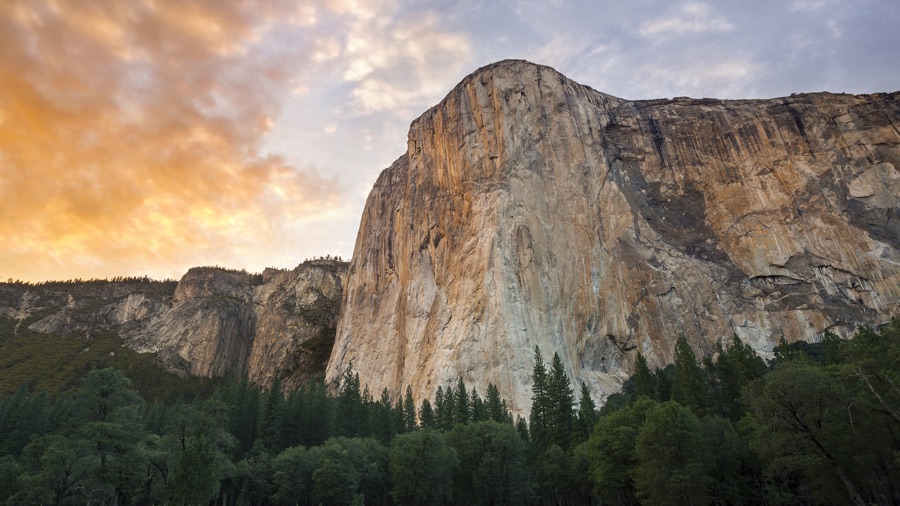
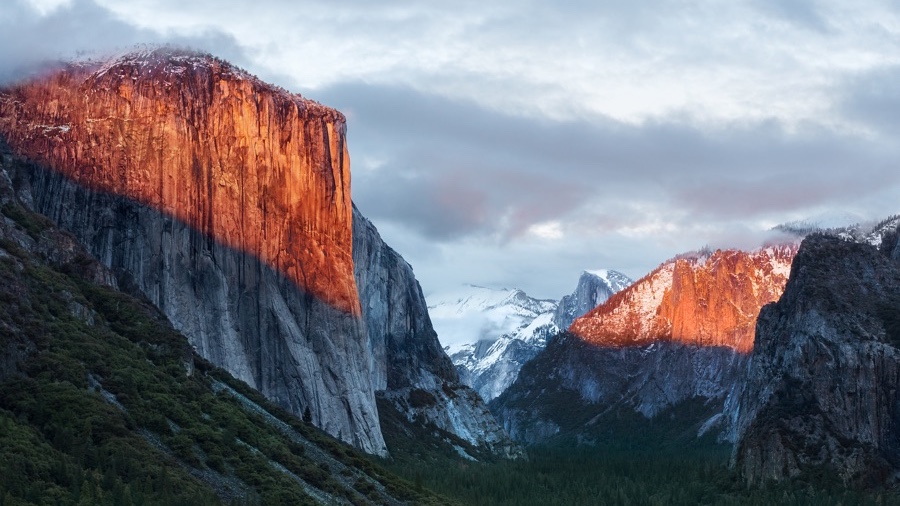
<img src="img/osx-el-capitan.jpg" class="img-responsive ..." alt="...">
<img src="img/osx-el-capitan.jpg" class="img-fit-contain ..." alt="...">
<img src="img/osx-el-capitan.jpg" class="img-fit-cover ..." alt="...">
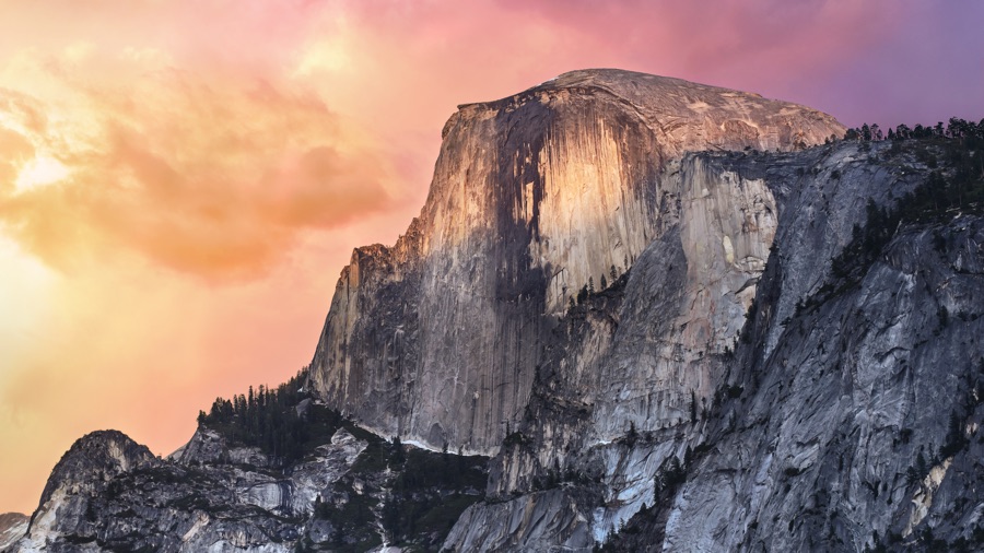
You can use the element <figure> for an image with a caption. Add the figure class to <figure> element. The images with the img-responsive class will be responsive. And the included class figure-caption will provide basic style for caption. Also, you can use text-left, text-center and text-right for caption alignment.
<figure class="figure">
  <img src="img/osx-yosemite-2.jpg" class="img-responsive ..." alt="...">
  <figcaption class="figure-caption text-center">macOS Yosemite wallpaper</figcaption>
</figure>
Video
For responsive video, add a container with the video-responsive class. Insert any YouTube, Youku or other iframe/embed video inside the container. The ratio is 16:9 by default. You may add video-responsive-4-3 for 4:3 ratio video container or video-responsive-1-1 for 1:1 ratio.
For responsive video elements, you can add the video-responsive class directly to the video.
<div class="video-responsive video-responsive-4-3">
  <iframe src="..." width="..." height="..." frameborder="0" allowfullscreen></iframe>
</div>

<video class="video-responsive" src="...">...</video>